Early attempts at dressing where you arrived in a striped top and polka-dot bottoms may not have earned your rewards when you were little. In fact, it may have put you off mixing patterns at all. After all, playing it safe with solids and neutrals is much less intimidating. But in your home, all that seamlessness leaves you somewhat uninspired. Here are simple, and less angst-causing ways to mix it up in your home.
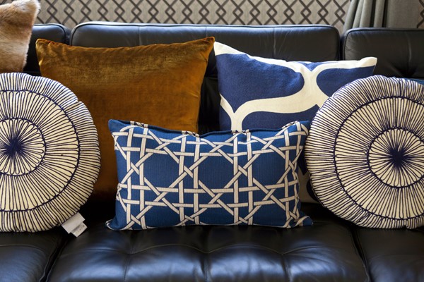
Throw pillows:
Add life to the party with one stripe and one floral or geometric in similar or coordinating colors. If you want a display bolder look, use contrasting colors such as a bright red stripe with a chartreuse green geometric against your gray sofa. Or pick one large print and one small print in the same or reverse colors. Then, add a third pattern such as a stripe or plaid to pull it all together.
Change up the fabrics and textures too. Put a crisp black canvas or duck weave with a soft green and blue velour print. Or mix a paisley pattern with stripes or blocks. The variety draws the eye to multiple places and can even camouflage a dated sofa or chair.
Carpets:
Mix up your carpet styles too. If you have a traditional carpet pattern in the living room, liven it up with an overlapping sea-grass weave in high traffic areas. Place florals and paisleys within eyesight of each other or put a bold stripe in the entry to the living area.
Blankets:
Mix up those plaid plush blankets with a lovely vintage granny-square crocheted afghan or hang a hand-made quilt over the arm of a pattered high-back chair.
Vintage pieces:
Experiment with mixing different wood colors and textures too. Place a Victorian table in a dark wood next to a mid-century arm or slipper chair with light legs. Lean a decorative brass screen against the fireplace next to a glass urn from a completely different era. Stack re-discovered suitcases as a side table and set a modern lamp with a mod-print shade on top.
The thing about mixing stripes and patterns or delicate prints with geometrics is that is the balance can come from either the design or the piece. So, a large cushion in a subtle pattern next to a smaller one with a bold stripe works because neither one outdoes the other. The key is to pick things you like, then balance them with other items that share a color or feature or are their direct opposite on the color wheel.
About the Author

Maureen Citarella
Hi, I'm Maureen Citarella and I'd love to assist you. Whether you're in the research phase at the beginning of your real estate search or you know exactly what you're looking for, you'll benefit from having a real estate professional by your side. I'd be honored to put my real estate experience to work for you.